Monday, December 15, 2008

Facets

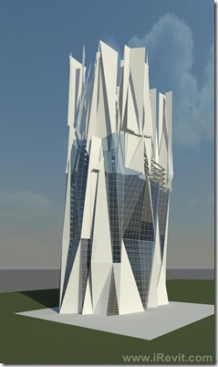
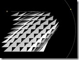
My last post mentioned the parametric facet massing family component I have been working on. The little image I posted may have given you an idea of what it is supposed to do. But I have had a couple hours to push my little project further and test it out on a quick building design, providing a more descriptive image. Four of these faceted components are used for the base and four are used for the fractured top in the image below:

Fracture-Render-3e click for full size image

Essentially the component does two things:

1. Creates faceted facades based on several parametric values

i. height, width of the overall assembly and of each facet section, position of each facet section, depth of facet angle, etc. etc.

2. As a massing component, it gives the ability to selectively apply wall types to each facet face.

Below is the layout of the system:

Fracture setup

And below is the parameter set:

Fracture setup-params

One of the tricks to making this work is creating a method for two of these to join up at the edges without an apparent or disconnected condition. This is achieved be creating a consistent facet edge condition, even under facet angle change.

This component can be expanded to the nth degree with more facets and controls. Also, by adding cutting voids to the component family, we can begin to lose the right angle corners at the tops. I would like to rotate and slope this assembly as well but I haven't figured that part out yet. I think I'm going to have to rebuild it or nest it into another component and link the parameters through to do that. If you have ideas, send them to me.

The building sketch above uses two types of this component. The type used on the base facade is the typical one described above. The second type is a modified version of the above that has had it's workplane association removed, causing the fracturing of the system. Another feature of this component is that you don't have to use every face, but instead can selectively choose faces to use, leaving others empty.

Here's a little video walking you through the creation of a building shell using this massing component (narrated by Alvin the chipmunk):


Download the file here: Facet Component Families

Cheers,

Craig

Wednesday, December 10, 2008

Design Slam @ AU 2008

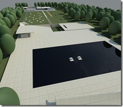
After walking away from a smoking mouse last Wednesday night, I find myself icing down my mousing arm and keyboard fingers, and still recovering, but that's right, I won the Design Slam! It was sure fun! Here's couple Renders of my design:

3D View 11

3D View 10

BARCELONA PAVILLION Section 2

BARCELONA PAVILLION Section 1

I have never been to Mies Van Der Rohe’s German Pavilion in Barcelona, but have a new appreciation for it after this awesome competition. The pavilion is very much about space, material and perception. It is a difficult challenge to respond to it with another pavilion while respecting its position in Architectural history. So instead of competing with it, I chose to deconstruct it in the neighboring landscape, providing opportunities to perceive its elements in a new way. This expression of the pavilion becomes more of a landscape than another pavilion, yet provides the same amenities of seating and shelter and vantage point, and also makes use of the existing reflecting pool at the opposite end. In looking at it now, the design almost reads as remnants of construction of the original pavilion, which is an unintentional bonus. The whole experience was a pleasure, albeit a little stressful, cranking out a design in the 20 minutes!

My presentations went well and the rest of the conference was fantastic. The Newport application was presented and should be showing up on Autodesk Labs soon. I can tell you that it is a cutting edge, real-time, visualization tool, that enables you to take your Revit models via FBX to new levels of experience. I'll talk more about this at the end of the month.

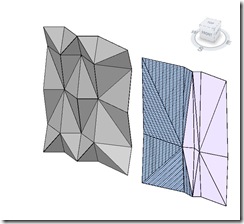
I've been toying with another thing, inspired by a project we are doing in Riyadh. A faceted design in Revit should be relatively easy correct? Well maybe not but what if you had a massing family that let you adjust the facets of your facade as you pleased?

facets

These examples are a quick, proof of concept with the one on the left skinned with Generic wall and the one on the left partially skinned with a curtain system. The facets are adjustable in many ways but will always be cohesive. It is something that uses the void-hosting technique that Phil Read showed off a while back for curtain panels, but releasing it from the panel restrictions to be a more free-form or large scale building envelope that uses a portion of these facets to make up it's facade. This in combination with other masses could whip up a slew of design options for a faceted tower in Riyadh.

Cheers!

Wednesday, November 26, 2008

Autodesk University 2008 ~ Design Slam

design slam

This year's AU is set to be a very busy one for me. I'll be Presenting a session called "Techniques for large project Architectural interiors in Revit" on Tuesday December 2nd at the Venetian hotel in Las Vegas. Then on on Thursday I'll be presenting an Autodesk Newport(you'll have to be at AU to find out what Newport is) project I have been working on at KlingStubbins. But to top all of this, on Wednesday night I will be competing against two other Reviteers in the AU Design Slam! The event proves to be very entertaining with 20 minutes to crank out a design in Revit, while our screens are projected high in the air to an on-looking rave-like audience of AU attendees. If you are at AU, come and cheer me on!

AU Design Slam
Wednesday, December 3
7:00 p.m.–9:00 p.m.
Palazzo, Halls A–D
Venetian Hotel

Come and say Hi. See you there!

Monday, October 20, 2008

ACADIA '08 - Expanding the boundaries of Computer Aided Architectural Design

Minneapolis, MN - This year's ACADIA conference [Association for Computer Aided Design in Architecture]  was titled "Silicon & Skin" and had a theme of bio-mimicry or studying natural systems to inform an architecture. These complex designs are achieved through a process or processes of generative design. Generating an Architecture by means of modular systems created and modified by factors of interest is a hot topic in design. Technological advances [both hardware and software] have made possible the deep exploration of architectural theories in this area of focus. The most commonly used software tools used for generative design are

  1. Grasshopper plug-in for Rhino,
  2. Generative Components and
  3. Revit Architecture.

Other tools used for generative purposes at this conference were developed by Architectural firms and Universities in-house. Scripting is the buzz-word of this genre of Architectural designers. Along side these tools are mathematical tools to understand and develop algorithms and mathematics behind form. All of these are used to explore and design systems that create environments.

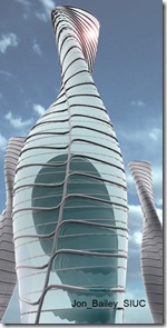
Rhino3D with the Grasshopper plugin is the most recently developed generative tool currently offered free by McNeel. A huge benefit of this tool for a cutting-edge design firm is the ease of getting Rhino-Grasshopper generated geometry into Revit Architecture for BIM documentation. See this post for a demo. The results of the Grasshopper plug-in are as responsive and as complex as you can imagine.

ACADIA-GH-Jon_Bailey_SIUC
Generated in Grasshopper
by Jon Bailey

3D View 1 
Generated in Revit by Craig Barbieri
growth2  Generated in Revit by Craig Barbieri

ACADIA-GC-JasonJohnson
Generated in GC by Jason Johnson
ACADIA-GC-JoseGalarza
Generated in GC by Jose Galarza
There were three workshops at the start of the conference focusing on each of the three main generative tools above. At the end of the 2 and 3 day(GC) workshops, the students' work was presented. The goals of the workshops varied but I will note that the only two workshops that produced a recognizable Architectural form were the Grasshopper and Revit workshops. To the Left you see a Grasshopper generated form rendered in Rhino. Below left you see several forms generated and rendered in Revit. Both of these workshop classes lasted two days and began at the introductory level.
Rhino's ability to create and modify organic form makes it a clear winner in my judgement. It's ability lends itself more closely to the theme of this conference.

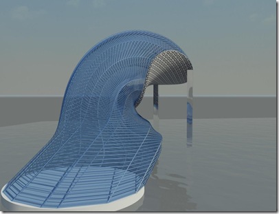
Revit's capability to generate form is far more limiting, currently, but as I have shown in previous posts, the engine at Revit's core can handle complex geometries. To generate form it requires one to use a mathematical 'change per level' as it's basis. As a result, your generated design is segmented instead of being a single mass. The image to the left is an exaggeration of this segmentation, indicating the level change at each break. The visibility of the level change is not typical unless the modules are created as rigid and the math is incorrect.
Kuen1Superellipsoid

Revit's main hang-up is that the geometric tools currently available leave something to be desired, and the ability of creating a single complex form from a single equation is not accessible. I expect this fact to change soon. The 2009 revision introduced the 'swept blend' and 2010 revision will add ... hopefully a great deal more.

Another avenue to generative design might be the Revit API. I suppose if the Rhino development team can create a 2.14Mb grasshopper plug-in to be as functional a generative component as it is, I am sure their is a talented API developer somewhere out there that can do something similar for Revit.

The Generative Components class was a three day course and the results of the course were markedly different as you can see from the images to the above left. GC has on it's side the benefits of it's engineering background but the results after a 3 day long workshop left a lot to be desired for the quick creation of an Architectural form. From my vantage point the potential is great if time is not a critical factor. Several of the papers and presentations used GC as the foundation tool. I was amazed at the number of design iterations and explorations many of these GC designers performed over a period of months to get the results that they did. I later found that most of those who presented were academic faculty and had the benefit of their classes as their work horse(s). With this experience I come to the conclusion that GC has great capability when partnered with a team of talented mathematicians and scriptors, but is not well suited to a large firm with tight budgets and schedules. I have not yet explored the porting of GC-generated designs to the Revit platform but as of yet haven't seen a simple demonstration like that of designreform.net, taking the geometry into a true BIM platform such as Revit. In discussions with a representative of GC's creator, the interoperability with the preeminent BIM platform falls short of possible. This is a very bad strategy on their part in my opinion.
GC has been the most popular and trendy tool for generating design and has influenced the world of digital architectural theory into a module-focused fetish. There were a number of presentations at this conference that looked at very small modular relationships based on organic systems that they carried through to develop a "occupiable space". Whether or not the creations were build-able in a practical sense or not remains questionable.

Of the three applications, Grasshopper currently has the most generative potential for Architects. While Revit is capable as a generative modeler, it is not as easy to develop comparable responsive geometries as in Grasshopper. GC is seemingly the most comprehensive generative tool but it's complexity, plethora of required applications, learning curve, and archaic user interface keeps it from reaching its potential as a practical tool for architectural firms at the cutting edge.

What was missing from this conference was Catia, Geomagic, Gehry Technologies Digital Project and Autodesk Inventor and Maya, among others. These tools clearly belong in the tool-belt of the modern techno-savvy Architect, but were neglected by the majority of the iphone-toting black-garbed trend-induced "Architects" Architects speaking at this conference. Feel free to leave comments ;)

Conference theme: Biology and Architecture

As described earlier, the title of this conference was "Silicon & Skin", representing a theme of studying natural systems to inform an architecture. Biological inspiration and technological implementation is a technique that has been used for thousands of years, but never referring to the scale to which we do today. An example of how applicable the theme may be is the eye of a Fly which is remarkably similar to a geodesic dome. Another example is that of the surface tension of a bubble and the Chinese National Aquatics Center. Both lending themselves to both Architectural design and structure. These are simple and literal examples. More profound examples of natural systems the warrant architectural exploration are those of the capabilities of natural system, such as drag reduction(shark skin) adhesion(penguin feather) Mass transfer (stomata cells in plant leaves(trees can move water up 100meters without a pump) or pores in insect exoskeleton), transparency( collagen fibres in cornea). Such natural systems have the potential to inspire profound architecture.

In general the conference was a valuable experience and one that refreshingly woke the slumbering academic in me. It has been a long time since I took a temporal section through a dynamic system or discussed the intricacies of a chreod. The keynote speakers were inspirational and the presentations of the various academics and practitioners verified my assumptions of generative architectures as being of the now. Those who generate design base on rules they set or systems they are inspired by are the Architects of the current and next generation. This generative technology will develop further, become easier, grow in capability and practicality. Those large firms that can harness it's potential now will make a name for themselves in the design community.

Specialist Design Group and the Black Box Studio

How does a large firm harness the potential of this generative wave? At the conference several representatives of different firms spoke of their "Specialist Groups". A number of large and medium sized firms have established a specialist design group that is comprised of talented young designers who are capable in scripting, advanced 3D generation, modeling, writing their own software, etc. These groups are used by designers and project teams to create and develop challenging designs and establish the methods of development and documentation. Foster and Partners calls theirs the SMG or Specialist Modeling Group and SOM calls theirs the "Black Box Studio". This is something similar to what I heard about RTKL's "Studio X" yet as I understand it, this group was specifically a Revit specialist group. From their appearances and excitement at the conference, the representatives of these specialist groups were fervent about what they did and loved an impossible challenge. They are the type that work on similar problems for fun and develop robust software tools when a need is recognized or proposed. The formation of one of these groups are one way of pushing practice technology in the direction your firm wants to go. Is it the only way? No. The number of free software tools and freelance programmers and avenues for such work in today's market makes it practical to hire out development if you don't have a team in-house. The marketability of having a team in-house is another story...

3D printers in workflows

3D printers are currently being used in architectural design workflows and their use is growing significantly. Case Study: Foster & Partners purchased their first 3D printer in 2005 placing it on their design floor and incorporating it into their workflow. Initially they created about 4 models per week. This number has increased significantly to where Brady Peters of F&P proclaimed they have two currently running 24 hours per day. Each project currently has at any stage in it's development an array of 3D printed design iterations.  These printers are located on their design studio floor. In a Revit-based workflow the use of one these devices is a big step in the direction of advanced design. Revit can export directly to an STL file for printing and though I have not yet tested the process yet, I look forward to in the coming weeks.

Friday, October 10, 2008

Complex Geometry in Revit 2009

Hi Folks! It's past midnight and you are catching me blogging again. I'm a little overdue for a post but you know that when duty calls, blogging stalls. Generative design is a hot topic these days and so is complex architectural geometry. I hear from a number of people in my firm that it is too difficult or impossible to create organic complex geometries in Revit. Do you hear this too? Well don't worry, complex geometry in Revit2009 is a very real and possible and I find it relatively easy. Call me lucky.

There are two main methods of creating complex forms in Revit.

  1. Using the Loft Blend solid and void tools or twisted blends or other combinations of solid and voids is one technique you might expect. To get an architecturally organic form, it is important to create named reference planes at the drawing plane angles you need. This is a bit of a mental leap as an architect generally thinks in terms of Plans, elevations, projections, and sections that are usually orthographic. Once your base reference planes are set you can draw in the 3D view on these planes by setting them as active workplanes(Tools\Workplanes\Set Work Plane) to start your sketch. Also when sketching you can orient the 3d view to the active workplane which makes sketching easier. This should get you well ahead of your neighbor in creating complex forms.
  2. The second method is a combination of an imported ACIS solid (not mesh) through AutoCAD from an application like Rhino into a Revit massing. This is a completely valid and practical method of creating complex building forms. It gives you the plethora of advanced form building tools of Rhino and the update-able massing capabilities of Revit. To add a bit more functionality(that I wish Revit had built in), Rhino has it's generative design plugin called 'Grasshopper' which I highly recommend.

The example below is a super-quick one to show the kinds of complex geometries possible and show that is isn't a simple surface model but a full Building Information Model. Note that when working with forms such as this, as with most applications, the curvature and complexity can begin  to weigh-down your model file quickly so a higher-end workstation such as an animator's will prove valuable.

Rhino 3D View 1

Perspective View

Rhino plan  Second floor plan

Rhino 3D View 2

Perspective View

Saturday, August 30, 2008

Hauer explorations continued

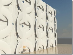
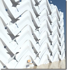
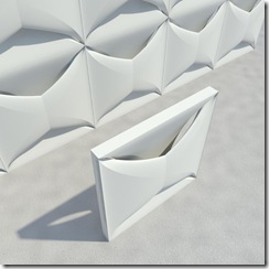
Although the tools available in Revit make it very difficult to get even remotely close to the prototypical Hauer panel like in the photo below without spending an inordinate amount of time, we can still explore some of the ideas. Addition, subtraction, perceived connections, pattern, foreground, background, and opportunities for the play of light make the latest renditions of this exploration the closest in theory.

Hauer Panel test 4 

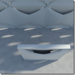
Minimally complex swept blends compiled to create perforation, negative space and depth tiled in a regular fashion.

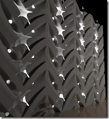
Hauer Panel test 4b

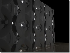
The "night" shot allows for the visualization of how the interior light bleeds through.

Hauer Panel test 5b

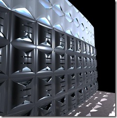
This would be the closest to the theory of Hauer's panels in my opinion. Void sweeps are the method of construction for this panel. The tiling method used is also much simpler than the first and makes for a continuity of form that the first did not have.

Hauer Panel test 5d

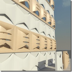
Greater shadow and light areas show clearly here. I think by far the most successful yet for the pay of light.

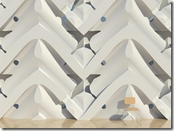
Hauer Panel test 5c

Close-up(the chair is for scale)

Ciao!

Monday, August 25, 2008

Exploring Erwin Hauer's opus in Revit

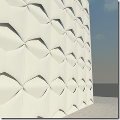
I recently attended a panel discussion at Siggraph 2008, where Enrique Rosado discussed his work with Viennese Sculptor Erwin Hauer. Hauer explored continuous perforated modular structures that as architectural panels, expanded into infinite surfaces with escher-esque qualities. Inspired by the idea of these panelized systems,  I made a first attempt at one as a Revit Curtain wall panel. From the rendered image, you can see the joins relatively clearly, but it has potential. By using the swept blend tool I came close to having a continuous weave. The negative space in my rendition needs to be expanded and the line at which they join to the next needs to be more fluid. With experimentation, the panelization is very dramatic.

Hauer Panel test 1

The negative space in the panel creates an unclosed form, allowing light to pass through and space for shadows to play.

Hauer Panel test 1 closeup

Below is one of Hauer and Rosado's panels on display at Siggraph. They clearly have mastered the art form.

 
Erwin Hauer and Enrique Rosado
EHR Associates LLC

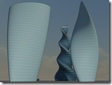
The modern equivalent of the above is the mathematically based fractal sculptures, also on exhibit at Siggraph, below. I'd like to see that done in Revit. No, really. Doesn't Autodesk have one of the geniuses behind Generative Components on staff now? Generative procedures in Revit are limited and difficult to use effectively in my opinion. A full featured generative feature in Revit would be a powerful addition the tool. A third party tool that could import into Revit with parametric and/or structural information would be useful too. That's enough rambling for today.

A couple more shots of my little playtime panels:

Hauer Panel test 1 closeup2

Hauer Panel test 3c

Hauer Panel test 2


Cheers!

Tuesday, August 5, 2008

One Step further into the Future

This is not a Revit related post, at least not yet, but I felt it drives home a point, which is that our future as Architects and Designers will be very different to what we have known for the past 20 to 5000 years+/-.

The rate of change in the tools we use is accelerating and the current methods of designing and documenting a design through the disconnection of a mouse may well change back to a much more active, interactive and immersive method. I say change 'back' because many of us learned Architecture when the pencil and ink were still commonly used in documentation; a method where one's whole body was enlisted.

Obscura's Visionaire, (the first video below) an adaptation of haptic interface technology, is another amazing development in the burgeoning user interface revolution. I'm sure most of you will agree that this technology doesn't lend itself well to measured documentation, or even measured Building Information Modeling, yet. Imagine standing all day long as you dance around your van-sized monitor, designing and building your model! We would get a great workout at work! But in the next 5-15 years some talented software/hardware developer will redefine the methods with which we design.


Thursday, July 31, 2008

Large Project's & Lighting

Recently one of the discussion's we have been having in the office is about lighting in large projects where there is an Architecture model and a separate MEP model.

 bulb

As an Architect, I want to place and move lighting as I work and so do our Interiors folks. The electrical Engineer needs the lighting in his MEP model to make the electrical connections and get his loads totaled and etc.. When there are two separate models, there arises a question of how to handle this in the most practical and efficient manner and there are two obvious solutions, each with there own merits.

The First solution is to maintain the lighting in the Architecture model. This means that in order for Electrical to make the necessary connections, they need to place a face-hosted "Connector Family" onto a face of the light fixture and maintain the correct information that relates to the luminaries, in the connector family. This is by far the easiest up-front solution, but...

The Second solution is to have the Architect place lighting in the MEP model, providing MEP with the most practical coordination option. The caveats with this method are firstly that ceiling hosted lighting will need to be changed to face hosted or workplane hosted as there are typically no ceilings in an MEP model; And secondly, that the ceiling in the architectural model will have to be manually coordinated (holes cut) for recessed lighting and etc.. This method provides the least risk for coordination errors, as a lighting fixture change can be transparent for example switching two-lamp to four-lamp luminaries. The change in fixture size will be noticeable in a coordination view in the Architecture model, and the ceiling can be adjusted.

The second option is what we are using and so far it's working out well. Perhaps after a couple releases of Revit, this issue will be solved. A related focus of attention is how to handle lighting analysis and we have been using 3DMax's new lighting analysis assistant with good result, but perhaps that's another post.

Wednesday, May 28, 2008

Immersive Building Information Model viewing


My friend over at BIMx posted HKS Gaming Engine for BIM which discusses using Environment engines or "gaming" engines with BIM and which is long overdue for Architecture and design. Essentially this is not static image rendering but real-time immersive environments. I have seen attempts at this before but never to the extent or ease that I expect. Design firms spend thousands of dollars to produce a single static image of a 3 dimensional architectural model having materials and lighting and textures and entourage.  When all of this information is used to create a static rendering or at best an animation or walk-through, there is a grand loss of effort and energy and information. In my opinion it is an almost wasted effort and definitely and archaic method of architectural representation. Granted, the static rendering serves its purpose but it is essentially a huge waste of energy and information assets.

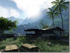
The imagery generated from Revit 2009's Mental Ray engine, isn't much better than the realtime rendering achieved by DirectX10 shown in these images, and note that the complexity here is the same or more when you take into consideration the geometries necessary for the secondary elements and entourage such as vegetation, video, volumetric lighting, and etc:

354 

HalfLife2_City17_TrainStationSquare 

77 

metastasis-3

But that's not all these pretty immersive experiences provide through environment engines such as "Unreal Engine3" and Valve's "Source" engine. You get realistic physics, surround sound, particle effects, multi-layered textures, complex lighting and reflections. All provided and generated in real-time as you walk through the environment with your keyboard and mouse much like so many people do in games and the ever popular MMORPG's.

I see this Archengine from HKS a step closer to what we can currently experience in existing "gaming" engines but it has a way to go. check out the video here and click on Portfolio. Another company providing a somewhat similar system idea is Applied IDEAS. Ken and Pia Maffei presented their 3DMax-based method at AU2007.

The typical example of the current engine's physics and other capabilities is nothing but underused if you look at this example (wow) [you should press mute before you click here]

2127303245_53cdabf897_o

The main problem that no one has really solved yet (or maybe Archengine has?) is the automated translation/filtering of the BIM to the surface model and environment data necessary for use in this manner. Solve this and tie it to one of these virtual environment engines("gaming engines") enabling Architects and design firms to export and package up their clients' projects on a disc to be installed on their kids' computers. Don't forget to include the standard footstep audio and etc. Easily a multi-million dollar opportunity still untapped. 

Saturday, May 24, 2008

TIP: The Open/Close or Welcome Page

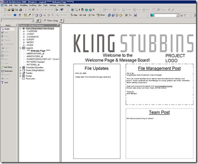
One of the most useful tools we use at KlingStubbins is what we call the the Open/Close or Welcome Page. It has several uses especially for larger Work-sharing projects and teams, and is also useful for smaller projects.

Welcome Page

  1. Welcome page as file/team information page - Being able to have a quick summary of file, project and team information when the file is opened is invaluable.
    1. Company name(self promotion) and Client logo and/or project name - self explanatory, but worth noting. The project is instantly recognized an it is clear which file has been opened.
    2. File updates - Here the Revit team Leader notes dates and times of file compressing, archiving, purging unused, transferring project standards, Reviewing Warnings, Major version upgrades, and so forth. It serves as a reminder to do these things as much as it is a notice that they were done.
    3. File Management Post - Here we explain the importance of always Saving to Central on this page, as well as listing the team members and their roles such as Revit Leader, Project Architect, Project Manager, Structural and MEP team members and contact information.
    4. Team Post - This is useful for team members to post other information, not always project related. Some examples are Reminders of team meetings and happy-hours, Birthdays, and random stuff. 
  2. Welcome Page as time saver - By saving to central with this view maximized, there are other benefits.
    1. The team sees this page and it's update info every time they save to central
    2. The processing requirements of this page are minimal compared to a plan or 3D view. This means that loading the file will be quicker and has a noticeable impact on large projects.
    3. This is a Neutral view. This is a common view. Many team members find it annoying when they open the file to another team members working view, which they have to close and open up their own working view[we use the method of having working views for each team member which they tack their names on at the end and work in, and then have separate sheet views which always maintain their Visibility/Graphics settings].
    4. By keeping this view open but minimized, Saving to central is as easy as maximizing the view and selecting Save to Central from the file menu.
  3. Part of the office templates - This page is also part of the office template and continues to grow in it's usefulness and creative team members continue to add to it.
  4. A simple Legend view - We use a Legend view to host this tool. You could also use a drafting view or a sheet view, though the Legend is most convenient as we generally do not have very many, compare to the number of sheets and drafting views the project finishes with, making it easier to find if it is closed.

Lots of information can be added to this view including some typical how-to's and etc. but be careful not to overload it or you'll be negating the second point of having it. And that's it.

Tuesday, May 6, 2008

I get this question a lot

I get this question a lot - I love hearing from people about their projects and renderings - so I thought I'd post this one

To: craig irevit.com
Subject: Rendering Settings

Dear Craig,

What settings do you typically use for interior and exterior renderings to get the best rendering?  In switching over to Revit 2009, I am having a hard time getting the same, if better, quality of renderings. 

Also, are there no clouds anymore in 2009?  When we adjust the setting for sky, we never get clouds, no matter the setting chosen.  Also, what settings have you found to typically work for quality?  Such as general options, image precision, ext. 

Thanks,

Sara

______________________________________________

Hi Sara,

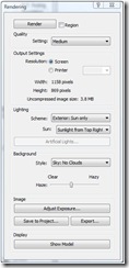
In the Render Dialog, there is a setting for the “Scheme” in the lighting area. You want to choose the most appropriate/applicable setting for the type of rendering you have. If you are using it for interior rendering, and have lights inside the space, and windows, you will want “Interior:Sun and Artificial”. This choice makes a huge difference in the way and locations the mental-ray rendering engine bounces light.

 Render  exposure

When you render with “draft” or “low” quality settings you will get a good enough image to judge whether the settings are providing what you are looking for. If it looks good, then you can render with “Best”. Once you get the lighting right, and render with the “best” setting, then you can use the “Adjust Exposure” button and adjust the various values for more contrast and etc.  Below are two examples of the differences achieved with the settings.
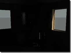
3D View 1

Image with Lighting Scheme: Exterior Sun only, and no exposure adjustment, Quality-Low
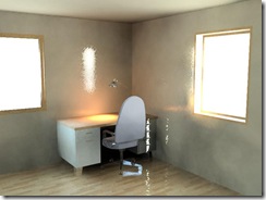
 3D View 2

Image with Lighting Scheme: Interior Sun and Artificial and exposure value at 8.2, Quality-Medium

 3D-View-2b

Image with Lighting Scheme: Interior Sun and Artificial and exposure value at 8.2, Quality-Medium and hidden line overlay

Clouds, and more

In terms of clouds, yes there are still clouds available. The setting is located below the lighting in the background settings. You have the option of 5 degrees of cloudiness or a color, as well as a slider for haziness. Below you see three different cloudiness settings rendered with medium quality. I you don't get clouds no matter what settings you set, than I would have to believe that your installation was not complete and you did not get the Render package.

Other important considerations are choosing good materials, setting the best light direction and render quality. Revit 2009 has a much better library of materials than previous versions. You can also take the stock materials and vary the bump mapping depth and glossiness and etc. Remember to make a duplicate of the material before you change any of the settings. Once you have rendered your test in Draft setting, adjust the exposure with the "Adjust Exposure" button dialog. The exposure value will bring your rendering from the depths of pitch black to daylight exposure and beyond to over-bright white. Then you can play with the highlights and mid tones and other settings to get the perfect image.

3D View Render noclouds  Render-noclouds

Image with Lighting Scheme: Exterior Sun only,
Quality:Medium,
Background Style: No Clouds, and low haze

3D View Render clouds

Image with Lighting Scheme: Exterior Sun only,
Quality:Medium,
Background Style: Cloudy, and low haze
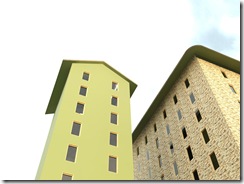
3D View Render verycloudy-nohaze

Image with Lighting Scheme: Exterior Sun only,
Quality:Medium,
Background Style: Very Cloudy, and no haze

3D View Render color

Image with Lighting Scheme: Exterior Sun only,
Quality:Medium,
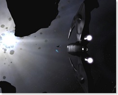
Background Style: Color-Black (note: no haze and no gradient available)

The output settings for your final image can be approximated by the end use of the image. For example if you plan on showing the image in a Powerpoint slide show, then the "Resolution" setting can be set to "Screen" and you can zoom in the view until the width and height is about 1024 pixels by 768 pixels. This would be fine for the typical Powerpoint.

If you intend on printing the image, a good resolution to use for typical prints is 150 DPI. By default the field of view is 6" by 4 1/4" but you can change the size by selecting the crop region of the Perspective 3D view and clicking the size button in the options bar shoeing the dimentions. In the "Crop Region Size" dialog that pops up, select "Scale(locked proportions" and change the width to the size of the space you need to fill. The height will adjust proportionately. Click OK and you will see that the view adjusts scale but doesn't change the extents.

CropSize

If you are still having trouble email the picture and/or file and I’ll check it out.
I’d love to see it when you’ve got it looking good.

Cheers,

Craig