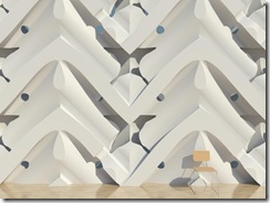
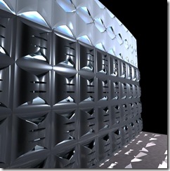
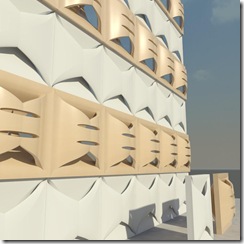
Although the tools available in Revit make it very difficult to get even remotely close to the prototypical Hauer panel like in the photo below without spending an inordinate amount of time, we can still explore some of the ideas. Addition, subtraction, perceived connections, pattern, foreground, background, and opportunities for the play of light make the latest renditions of this exploration the closest in theory.
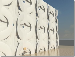
Minimally complex swept blends compiled to create perforation, negative space and depth tiled in a regular fashion.
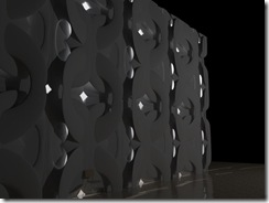
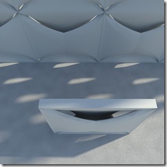
The "night" shot allows for the visualization of how the interior light bleeds through.
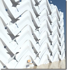
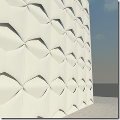
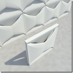
This would be the closest to the theory of Hauer's panels in my opinion. Void sweeps are the method of construction for this panel. The tiling method used is also much simpler than the first and makes for a continuity of form that the first did not have.
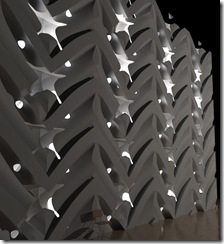
Greater shadow and light areas show clearly here. I think by far the most successful yet for the pay of light.
Close-up(the chair is for scale)
Ciao!

